CUP OF SUGAR
This prototype was designed for my Human Computer Interaction class at Cornell University. Our group of three students worked together the entire semester to create an app that would help college students prepare meals for themselves throughout busy semesters.
We created Cup of Sugar, an ingredient sharing app where students can request or offer ingredients to other students living nearby as well as track their own ingredients in a virtual pantry.
TARGET AND CHALLENGE
Over the course of the semester, our group was tasked with creating a solution to a problem of our choosing. We chose to help newly independent and busy college students who struggle with cooking. We needed a solution that allowed students to increase efficiency, save time and money, and maintain autonomy in regards to cooking.
RESPONSIBILITIES
Our team shared responsibilities so everyone could experience each part of the process. Together, we:
-
Brainstormed Ideas
-
Conducted User Research
-
Analyzed User Data
-
Created Prototypes
-
Self-analyzed and Improved on Designs

Analyzing User Data
PROCESS
Our project was created iteratively in several phases over the course of the semester. Each phase involved user research, analysis of that research, and some sort of design deliverable that increased in fidelity over the course of the project.
We began by interviewing four college students who cooked for themselves to get a sense of what they struggled with and desired regarding meal preparation. We then isolated individual points of data from our interview notes and sorted these points into categories, which we made insights about. Finally, we consolidated our data into a persona.

Kitchen from a contextual interview

Creating our Affinity Diagram
With the data from our interviews, we created a paper prototype. Using this prototype, we tested our initial design with three different users, giving them specific tasks to complete using the prototype.

Making a Request

Viewing Other Requests

Direct Messaging

Adding to Inventory
Using the feedback we got from testers, we developed a mid-fidelity prototype using Balsamiq.
We then tested this prototype within our group using a heuristic walkthrough to identify problems to solve in the next iteration.

Mid-Fidelity Activity Feed

Mid-Fidelity View Requests Page

Heuristic Evaluation Spreadsheet
For the next iteration, we created a high-fidelity prototype using Figma. We conducted a usability test with three new users, then refined and polished our design to present at our class showcase.

Figma Prototype

Ready for Usability Testing
DESIGN DECISIONS
Only after we completed our contextual interviews and user persona did we start to craft a solution and make design decisions. Our choices encompassed everything from the features we included to how we organized information, with all of these decisions relating back to our users and what we discovered through various phases of research.
FOOD SHARING PLATFORM
Many students we interviewed struggled to get ingredients for meals since grocery stores are not easily accessible on campus. Students also wanted more sense of community surrounding cooking. We chose to meet both these needs by creating an app where students could share food locally.
FOOD TRACKING PANTRY
Our pantry feature paired well with food sharing since users could check what they have before making an offer or request, even when they’re not at home. Users could also offer items directly from the pantry feature.
FRESH FEEL
Spring green color scheme and minimalist font and icons gave the app a healthy, lively feel.

Fresh green color scheme on the Pantry screen
NO ACTIVITY FEED
In the low- and mid-fidelity mockup, we included an activity feed of completed transactions from any user. While we wanted to give an impression that many people used the app, we decided to let the user discern that from the number of requests and offers visible in the marketplace. This helped us simplify our information architecture and made our design less confusing to users.
SIMPLE REQUEST FORM
We condensed multiple optional fields into one box for notes. This relieved the pressure to require compensation, sped up the request process, and allowed the community to establish their own information norms.
We also changed when users indicate whether they are making a request versus an offer. Having them choose before filling out the form reduced the chance of user error.


The three optional fields were condensed into one "notes" field with placeholder text suggesting information to include.
CLEANER INFORMATION ARCHITECTURE
Our heuristic analysis revealed that there was no way for users to view their requests in one place separate from the general feed. When we got rid of the activity feed, we also changed the nav to add in this view and separate the "make a request" button as an action button rather than a nav item. This helped keep our information architecture consistent by grouping like with like.
Separated the messages button from the requests and offers tabs
Separated "Make Request" button from the nav and moved it to the top
Separated personal activity from all activity


OUTCOMES AND ACHIEVEMENTS
We created a high-fidelity prototype in Figma along with a poster to document our process, both of which we displayed at our class showcase.
Key features of our app included
-
Separate views to browse requests and offers
-
Form to post requests and offers
-
My Activity page to track your requests and offers
-
Pantry feature to track your ingredients
-
Messaging platform to coordinate exchanges of ingredients
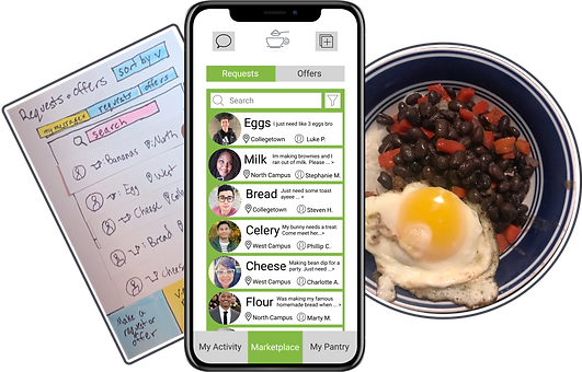
MAIN VIEWS
The three main screens are accessible from the bottom nav. The tabs at the top of the personal activity and the marketplace screen allow users to switch between seeing request and offers for ingredients. Users can search and filter the requests. The icon buttons in the top corners allow users to create requests/offers or go to the messaging center.

Personal Activity

Marketplace / Main Screen

Add to Pantry
MESSAGING
The messaging platform is accessible by the icon button in the top left corner of the main views. Direct messaging is also accessible by tapping a request on the main screen. The top panel expands/collapses to show full request information.

View Messages

Direct Messaging
REQUESTING INGREDIENTS
Users can choose to make an request or an offer by tapping the icon button in the top corner of the main views. From a drop-down, the user selects whether to make a request or an offer and then fills out the form. After a request (or offer) is made it shows up on the "my activity" screen, where the user can select it to view all responses to the request and mark the request as complete.
Make a Request

Viewing Your Request
PANTRY
In the pantry, users can add food by scanning a barcode, scanning a receipt, or manually filling out a form. Items can be removed or edited in the list by swiping to reveal more actions. When bulk adding items by receipt, the items are queued with an option to easily edit or remove before adding them to the pantry.

Add to Pantry

Submit to Pantry
CONCLUSION
Though we only created a prototype, if this app went live it would be significant in several ways. While other services exist to make cooking easier, our app is unique in making the local community an integral part of cooking. It also has the potential to reduce food waste and provide students easier access to fresh ingredients.
Our team of three was smaller than other groups, but we still managed to deliver a great prototype because we worked so well together. We all trusted each other to do our part and had frequent meetings where we worked together and then split up remaining tasks. Each member took and offered constructive criticism graciously.